Adding a Map to Your Web Site
 Local brick-n-mortar businesses, those who rely on walk-in, on-location commerce, will often have a web site to promote their business. It’s a good idea. The cost of having a web site is next to nothing, maintenance is easy if the site was built with updating in mind, and it can be a great service to existing and potential customers, depending on how it’s used. One such service would be helping the potential client find the business’s physical location. This can be easily facilitated by adding a location map to the site. How one should do this is the subject of this article.
A couple of years ago I developed a so-called best practice as it pertains to adding a visual map to a web site. This was for a restaurant client at the time. This “best practice” is my own, and you may find fault with it, but I’m still convinced it offers the greatest chances of meeting the needs of all a site’s visitors. Even those who don’t access a web page in the conventional sense. In other words I feel it is an accessible solution. It goes further, too, in that I think of this technique as one which offers a highly usable solution. It’s not the only viable solution, I want to be clear about that, but it is a method I like.
Sticking to the Basics
Barring the modern trickery of adding Google Maps or some other mapping tool to your site, the simplest, most universal way to add a map to your site is to use the good old img element and post a photo or drawn map. This method ordinarily means the image is hosted on your own server affording you complete control and assured availability. Also, being it is an image added with plain old HTML — versus a JavaScript (JS)-dependent widget — tools are in place that allow you to make it accessible. Without having to detect for scripting support, possibly erroneously.
Maps Gone Wild
A little JS never hurt anyone. Well, okay, maybe it has, but the point is I’m not opposed to it. If one wants to add a Google Maps to their site, for example, that is fine. It just needs to be backed up. Even my own best practice solution throws in some JS to give a basic image-based map installation a little life; some interactivity. Just because it’s local it doesn’t mean it can’t be fun — without the complete unavailability if the user isn’t the fun type.
The following demo/example uses some inline JS combined with the HTML img element to make things happen. I dare say there are probably more elegant solutions such as putting the JS in a separate file, for example, and perhaps there are good solutions available in the jQuery library. Investigate. For this article, inline will work well. Please note that the emphasized text which follows the heading below is also exemplary.
A Working Example
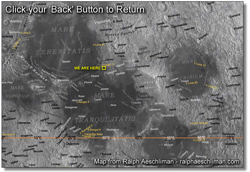
This is a map to the LunaMart moon outlet. If you need more help fiding us, please check out these written directions. You’re also welcome to call us at 800.BUY.LUNA, or email us with our contact form. On the map below, with JavaScript enabled, hover or focus for a zoomed view, click on the map to access a larger, printable version. A wide angle view is also available.
Even though this uses JS, it is still an accessible method.
Ensuring Accessibility, and Usability
This independent solution offers a bit of magic to provide the zooming out wide-angle view via mouse or keyboard — and it may be helpful to sighted visitors — but the real magic is in how it’s backed up. Here’s a list of features:
- A proper long description is offered. This is implemented by providing a separate document, preferably written in HTML so as to gain the benefits of semantic markup. This document is linked to as a full URL within the
longdescimage attribute. - The long description is also given as a regular link labeled as “Written Directions.” This is not only telling nomenclature, it has universal appeal. I often think of this as the best way to offer a long description link. Much better than the minimally required [D] link.
- The
altattribute is added, not to describe the image (a short alt description can’t do it justice) but to provide further instructions. A blind user whom this most satisfies can’t use the large image themselves, but it may benefit their driver. Knowing it’s there allows them to print it out for others. Thetitleattribute was added for mouse users.
The Working Code
Here’s the actual code used in this example, with the actual links used. The code below has been expanded onto three lines to make it more readable. This would normally be on one line.
<a href="/blog/examples/images/lunamart-map-large.jpg" title="Hover/focus for zoomed out view. Click for written directions" onmouseover="locmap.src='/blog/examples/images/lunamart-map-wide.jpg';" onfocus="locmap.src='/blog/examples/images/lunamart-map-wide.jpg';" onmouseout="locmap.src='/blog/examples/images/lunamart-map.jpg';" onblur="locmap.src='/blog/examples/images/lunamart-map.jpg';">
 <img class="center border" id="locmap" src="/blog/examples/images/lunamart-map.jpg" width="400" height="300" alt="Hover/focus for zoomed out view. Click for written directions" longdesc="http://green-beast.com/blog/examples/lunamart-ld.txt" />
</a>
Backup Methodology
The written directions are universal in their value. They should be written simply and be easy to understand. It is these written directions and the way I link to them that gives them this value. Everything else, including the actual map image, is backup. In the aerospace industry they call this redundancy. A fail safe. If one thing doesn’t work, something is provided to carry out it’s function. It’s a safe way of thinking. If one can’t use the map because they can’t see it, or if they can’t access the wide angle view normally because they don’t support JS, they’re still presented with the info they need to locate the business.
Redundancy doesn’t stop there either. If you noticed, in the paragraph of text preceding the image, the user is given some options such as calling, emailing, accessing the large version as well as the “written directions.” These practices ensure accessibility. They’re not fancy or sophisticated, but they don’t have to be and probably shouldn’t be/ They’re basic, simple, useful, and accessible. What more, I ask, could the web user really want?
Oh, sorry if you were expecting something fancy.


Rich Pedley responds:
Posted: December 1st, 2008 at 4:29 pm →
Roger has just posted about google maps Making Google Maps more accessible and the use of Google Static Maps API. Though even he admits it is rarely used.
Surely your method for the map is in reverse though? To me a natural order would be from the large version zooming in to the close up. Of course it could also be possible to use CSS to change the image rather than using javascript - though it might take me a some time to do myself.
As standard though I would normally have the written directions on the page rather than as a text file, but having them in whatever format is a given.
Mike Cherim responds:
Posted: December 1st, 2008 at 5:06 pm →
Admittedly Rich, I always battle internally as to whether I should zoom in or zoom out. I chose the order I did so if the user didn’t have JS enabled they could get the fine details they might need by default, and then get a large area view with the printable version. What they miss is the medium area view, but I’m thinking that’s better than missing the detailed view.
Stevie D responds:
Posted: December 4th, 2008 at 9:34 am →
Ooh, don’t like that, sorry.
I find it confusing, distracting and a bit disorientating when hover/mouseOver/focus changes the content of the page.
If they’re just changing the presentation, eg background on links, that’s fine - the content isn’t changing, you’re just giving extra visual affordance as to the clickability of the link. But just as selecting a radio button shouldn’t take you to a new page, passing your mouse over a content image shouldn’t change that content image.
If it was done with Flash, and there was a zoom transition on mouseOver and mouseOut, that would probably be better - it’s more obvious what’s happening then, rather than SNAP it’s a different image SNAP it’s back SNAP why does it keep changing? SNAP what am I looking at now?
My preference for small business websites (obviously it’s different if you’re a major retailer with a hundred stores, you probably don’t want to be drawing your own maps for all of them) is to have a “hand-drawn” location map, maybe have two zoom levels, but in that case it might be best to show them side-by-side rather than have one replace the other, and to have very localised directions included - easier to see what’s going on, less confusing, and better for printing too. It may also be useful to give a Google Maps link too, so that people can get driving directions from wherever they want.
Michigan Web Design responds:
Posted: December 6th, 2008 at 12:28 pm →
Sounds like a great idea, if only it embedded well in the site.
Mike Cherim responds:
Posted: December 7th, 2008 at 10:55 am →
It is kinda snappy, Stevie, I agree. JS aside, the most salient point, however, is how the long description is linked and it’s link text. That is the most important consideration. Admittedly the JS/zooming is fluff. If someone walks away with one thing from this article, it is that I hope.
Rodney responds:
Posted: December 22nd, 2008 at 5:21 pm →
Speaking of accessibility: why not use CSS to change the image on hover ?
I also like this for zooming:
http://www.cssplay.co.uk/menu/enlarge
Mike Cherim responds:
Posted: December 22nd, 2008 at 6:34 pm →
Hey Rodney, that’s pretty cool. The answer to your question was because I needed the
imgtag for thelongdescattribute. But I see that sample has an embedded image so that’s just fine. The only thing I don’t like about that technique is its complexity, all that CSS and extraneous markup makes it a heavyweight solution, albeit clever. Just not sure it’s worth it. I do wonder why Stu didn’t usespanelements instead of all thoseemtags!If you want yet another option to Stu’s, here’s something similar. The second image can be whatever you like, not just as shown (so it could be a zoom tool). It’s probably a more accessible solution. It’s only real failing is under the images off/CSS on condition, but it’s a map so a clear written description will heal all wounds.
Thanks for sharing it all the same.
Rodney responds:
Posted: December 24th, 2008 at 5:41 am →
Hi Mike,
Have to agree with you that Stu’s solution takes a lot of extra coding, but I still wouldn’t call it ‘heavyweight’.
I just was wondering because you mentioned accessibility, and my opinion is that it’s more likely for someone to turn off js than to turn off CSS.
As for the span vs. em tags, that’s something I was wondering about myself.
Your example from your experiments-pages is very nice, you got me spending all evening going through all of your experiments a while ago. Great work.
Rafe responds:
Posted: February 20th, 2009 at 11:13 am →
Another take on it
a.mapswap{width: 400px;height: 300px;background:transparent url(http://green-beast.com/blog/examples/images/lunamart-map.jpg) no-repeat;display: block;}
a.mapswap:hover img{display:none;}
Mike Cherim responds:
Posted: February 20th, 2009 at 11:43 am →
I do mention the possibility of using a background image, Rafe. The big disadvantage to that is that a map isn’t decorative and probably should be embedded instead of being treated as decoration, complete with the
imgelement andlongdescattribute. As a background all of that is lost and it becomes invisible content to some users, even those who use Windows contrast accessibility tool as that’ll remove background colors and background images (it only keeps actual content and layout).Rafe responds:
Posted: February 20th, 2009 at 12:53 pm →
Sorry Mike.. I did include the image code but I must have gotten something wrong with your ‘code’ commands for the blog entry and it went awol. (Perhaps a delete option for the blog might be an added bonus for those of us who are merely human and stuff up)
the a.mapswap would be the anchor around the normal image. That way the image is there, all the information is there in the image, longdesc and everything else so meeting conformity 100%.
It is just hidden with a hover event. That wouldn’t be happening with anything other than a pointing device which would be a visual tool, at which point the alt and longdesc argument becomes moot (I think). I have to admit to not being 100% sure of how a longdesc is actually accessed.
a.mapswap{width: 400px;height: 300px;background:transparent url(http://green-beast.com/blog/examples/images/lunamart-map.jpg) no-repeat;display: block;}
a.mapswap:hover img{display:none;}
<a href=”http://green-beast.com/blog/examples/images/lunamart-map-large.jpg” class=”mapswap” title=”We are here”><img src=”http://green-beast.com/blog/examples/images/lunamart-map-wide.jpg” alt=”Hover/focus for zoomed out view. Click for written directions” longdesc=”http://green-beast.com/blog/examples/lunamart-ld.txt” /></a>
(crosses fingers and hopes it works this time)
Rafe responds:
Posted: February 20th, 2009 at 1:19 pm →
Perhaps my explaining my theory is a little lacking.
The background to the anchor is the enlarged version, or the hover state version of your current js.
The actual image is coded into the anchor exactly as you did.
All that happens on hover, is the image is hidden, revealing the background (enlarged version) behind it.
Mike Cherim responds:
Posted: February 20th, 2009 at 1:36 pm →
I see. Thanks.