Making Bad Images Look a Little Better
 This is a technique I use to make less than great images look a little better. Bear in mind this isn’t a good technique for print-quality images, nor is it terribly helpful for really large images where down-to-the-pixel perfection is required, but for web-use images under 800×600, this can be a real time saver — a down and dirty technique — with no heavy tools required, meaning most mid-range image editing software can handle this. Here’s how it’s done… In six, or so, easy steps. A poor man’s technique.
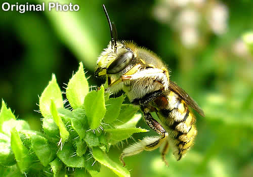
Step 1: The Original
Well, I’ll be, this isn’t a step at all. I guess there are only five steps. Anyway, I got this image from My Flicker, but I downgraded it by reducing export quality and increasing sharpness and contrast for this tutorial. The image had characteristics that I felt made it was a good candidate for this. In case you’re wondering, it is some sort of hover or syrphid fly, I think. Even though I am the bug guy, sadly, I haven’t looked it up. It is an extremely cool bug, though. This specimen and several others spent their days last summer flirting with some basil flowers (shown), hovering all the while.
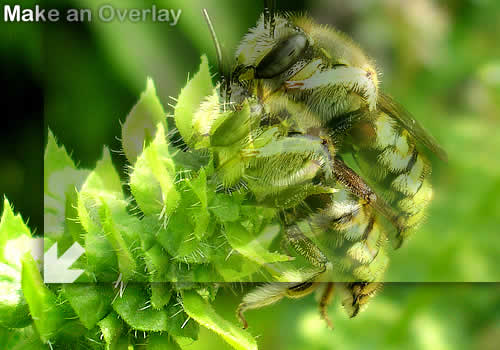
Step 2: Make an Overlay Copy
Or is that step 1? Hmm. Oh, well, let’s continue. Okay, this is important: make a copy of the too-sharp, too-contrasty, noisy, and distorted image above and paste it over the original. To ensure it lines itself up properly, reduce it to about 50% transparent so both layers are visible. Once lined up, reduce the upper layer to 100% transparency and select the underlying layer.
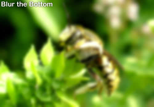
Step 3: Apply a Gaussian Blur
You should now be looking at the selected bottom layer, the lower image. Apply a Gaussian blur to it. Using Fireworks as I do, the default blur pixel radius is 4.1. This, or a greater number, up to 6 or so should be used, depending on the photo. Yes, it will be blurry, but we’ll change all that. The reason for the blur is to blend those contrasty areas and cover up that noise. Think of it as apply a pancake make up — sort of like powdering your nose.
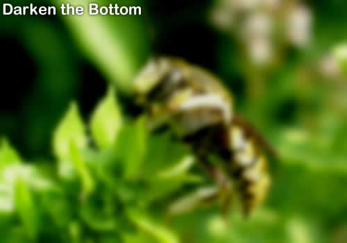
Step 4: Adjust Brightness of Bottom Layer
To save some image weight (file size), I darkened the bottom image. Doing this also replaces some of the photo’s richness and depth that can be lost in this process. Some images, if already dark, will probably require an opposite treatment. Experiment.
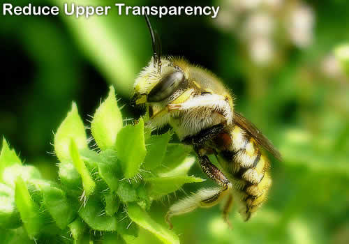
Step 5: Bring Back the Top Layer
Now the time has come to restore some of the sharpness over that layer of wrinkle cream. As transparency is reduced (opacity restored) the edges will start to appear. The range you should aim for is about 40% to 80%. Somewhere between the two settings will be perfect, a balance between the two layers. You want the edges to be clear, while the areas in between to remain soft enough to hide the imperfections. Yet you still want to retain depth, clarity, and richness.
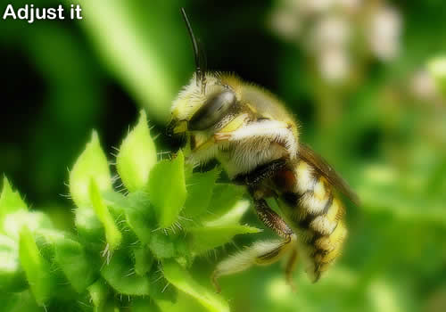
Step 6: Optional Adjustments
Maybe there are actually only four steps. The image above is effectively done. It is an improvement over the (example) “original” and of a smaller file size. But a little more tweaking, to experiment, is always fun, and possible since the settings can still be adjusted. Try adjusting brightness, that’s what I did, or play with transparency some, more or less, to adjust the surreal quality. I did that, too. Apply further file size optimization. I ended up saving a lot over the image above.
Why it’s Effective
A layer of partial sharpness masking a heavily made up underlying base layer. Another nice side effect of this technique is a file size reduction, as mentioned. For instance, in actual numbers, the original image in this example is a whopping 30.86kb. The second to last image is 23.85kb, and the final image is only 19.40kb. That’s a savings of 11.46kb from the original. That’s a significant amount, at the expense of… well, a slight increase in image quality. What a good deal.
Some Final Thoughts
This isn’t going to make bad images good, but as the title of this post says, it can make them look better. It’s not an effective correction for all images, but it can work for some, especially those with a limited amount of noise, artifacting, positive contrast, or sharpness issues.
It can also be used to purposely create a dream-state or surrealistic scenes. Play around with it. I just redid my hosting site (v5) and applied this technique to just about all of the images, both background and embedded. I made a lot of composites for the site, using good quality images from iStock.com (great deals over there), but some where a bit sharp, and softening them even a little didn’t do them justice. I started playing around with my previously posted dream scene technique, and I came up with this variant… Voila!

Adam responds:
Posted: March 20th, 2008 at 10:30 pm →
What is so wrong with the first image? From a photographers perspective the first image is MUCH better than the last, the “fixed” image is too dark, you loose a considerable amount of contrast, and almost all your detail.
I’m not really sure what you are trying to accomplish in the last photo, but there are certainly more effective ways to go about making an image like the first “better”
Mike Cherim responds:
Posted: March 20th, 2008 at 11:36 pm →
There is a significant amount of artifacting on the “original” and the contrast is too high. It was exported at 50% compression to make this happen for this post. The artifacting remains, just toned down a bit. The contrast issue went away. The amount of the adjustment, of course, is purely subjective. I think I like the image under step 5 the best, but the last step shaves file size, and I did want to stress the suggestion one experiment with the adjustments.
I should add that I have a very good monitor and the differences are pronounced to my eye, but they may be indistinct to some viewers.
Rafael Masoni responds:
Posted: March 21st, 2008 at 12:12 am →
When I started reading this article, I thought just like Adam: “What’s wrong with the original image?” and from which point of view the last one could possibly be better.
This image is so rich in details and now they’re gone.
The “over-layered-blur trick” is old and I think it didn’t fit well in this case particularly.
PS: thanks for the dial-up warning!
Gill responds:
Posted: March 21st, 2008 at 9:38 am →
The original image is far too punchy, at least, on my Mac screen it is. I think though I’d have stopped at step 5 if I was just displaying the image for the image sake I think however previous posters may have missed what Mike was trying to achieve.
Mike Cherim responds:
Posted: March 21st, 2008 at 7:35 pm →
@ Rafael:
I’ve been doing digital graphics (mainly for print) since 1995 and I never heard of it so we must run in different circles. As far as it being old, I’m no youngster so it’s fitting
@Gill:
Thanks, Gill. Glad someone got it. It’s not a solution, it’s a method that can lead someone to a solution. Perhaps a different image should have been used. I do think it’s a monitor issue, though. I noticed a lot of people think the background of this blog is white (exemplified by adding white backgrounds when they use the theme), but it’s not white (#fff), it’s off-white (#fafafa). To me the two colors are clearly different, but not everyone notices this and I suspect it’s monitor quality. That would account for 1) not seeing the issues present in the first image and 2) the fact that the details of the final image are muted more than they really are.
Let’s explore this:
This is white.
This is not.
Can you see the difference between these two boxes? To me it’s as clear as night and day. To others they will seem to be the same.
David Zemens - 1955 Design responds:
Posted: March 21st, 2008 at 8:18 pm →
I think you hit the nail on the head, Mike. Although your image manipulation is rather subtle, it looks completely different on my old Dell monitor than it does on my new ultrasharp HD monitor.
Anyone who has done much web developing realizes that sometimes what the end user sees is very different from what we see. Or from what we intended them to see, for that matter.
Georg responds:
Posted: March 21st, 2008 at 11:20 pm →
It’s definitely a monitor issue. Those image manipulation steps, and your little “white vs. light-gray” test, comes through quite clearly on all my 9 monitors. I would probably have stopped closer to step 5 for a case like yours, as step 6 brings the main object a little to much “out of focus” for my taste - and my screens.
That the method itself is old doesn’t mean there aren’t a lot of people who haven’t seen it used like this before. All image-optimization methods are old, and are rediscovered and/or reinvented by someone, in some new or old tool, all the time.
I have a strategy for deliberately setting some of my monitors off - using a number of presets, in order to catch some of the ways people actually see things on their own monitors, just to avoid me working on very subtle “image-corrections” for the web that few visitors can see. Subsequently, I’m not all that concerned with image-optimization anymore, since only a (small) minority will see my images the way I see them anyway - regardless of whether they’re optimized or not.
JackP responds:
Posted: March 22nd, 2008 at 6:31 am →
Nice technique (whether old or new). Thanks again Mike for teaching me a simple way to do something
PS I can clearly see differences between the first and last images (notably how much the ‘hairs’ stand out). I’d have to say it depends on what you’re wanting to show: for a post about the insect or plant, I’d say image #1 was better, but for a more generic post, image #5 is probably better as it gets the info across without being distracting.
Gill responds:
Posted: March 22nd, 2008 at 8:05 am →
@ Mike
Partly down to monitor. There are a lot of people though who think in the 16 standard colours. Whether they really can’t see the difference or whether they’re just not interested I’m not sure. They wouldn’t see the difference between your backgrounds, white is white just as very dark grey is black.
When I existed in corporate land I had a Cerise Pink suit. All the guys in the office referred to it as my Red suit. I tried on several occasions to point out it wasn’t red but they just couldn’t see it. Pink was what we’d refer to as baby pink or barbie pink, anything stronger than that was red.
David Zemens - 1955 Design responds:
Posted: March 22nd, 2008 at 8:14 am →
@Gil,
Either way, either a Cerise Pink or a red suit is pretty remarkable. You are going to get the reputation as being the Don Cherry of the web development world!
Mike Cherim responds:
Posted: March 22nd, 2008 at 10:19 am →
Very true. The treatment is more of a decorative thing but if the image was entomology-related editorial content then as much clarity as possible would a must.
Gill responds:
Posted: March 22nd, 2008 at 3:49 pm →
@David
LOL. Strangely enough, at school I was feared for my hockey stick wielding skills.
Rafael Masoni responds:
Posted: March 26th, 2008 at 10:44 pm →
Sorry, Mike. I didn’t mean to sound pejorative, I just couldn’t find other words to say that.
But it’s in fact old (not as old as you mentioned but old) and has also been spread and overused mainly by anime (japanese cartoon) fansites and the like. You can just have a peek out there in some forums and see everybody with signature images using this technique. It’s also all over fotologs.
I’m not saying it’s bad technique though, just that it’s not new and doesn’t necessarily makes images better, at least not by the photography’s point of view, in this case specifically.
Mike Cherim responds:
Posted: March 26th, 2008 at 11:00 pm →
That’s cool, Rafael. I really had no idea. I don’t frequent forums and the ones I do visit now and then tend to have member signatures that are usually not much more than a portfolio or blog link. Sometimes a quote. Web developer forums are boring like that. As far as anime, definitely not my thing.
The technique was new to me. I invented it… for myself anyway. It figures all I did reinvent some wheel. I do think it’s kind of cool, and there others out like me who may not have invented it for themselves yet so, it’s all good. No harm.
Thank you for sharing its background. Now I know
Jon responds:
Posted: May 6th, 2008 at 1:23 pm →
The original looks a lot better… the result looks blured
Altamira responds:
Posted: June 12th, 2008 at 4:10 am →
First one looks MUCH better than the last
Mike Cherim responds:
Posted: June 12th, 2008 at 6:16 pm →
Technically, though, it is of lesser quality for full-size printing and other uses were the level of quality is more important than it is on the web.