Killing Off Web Widows
 Please, let me explain. I speak not of wives without husbands. I am instead talking about a typographers’ term that defines an undesirable situation that looks bad in print and is best avoided for reasons of both aesthetics and readability. The term pertains primarily to print as said, but it also applies to a web page situation that, in my opinion, is also best avoided. I’m not going to provide graphical example of the aforementioned malady, but I will offer a quick definition of the term I’ve introduced you to.
Widows refers to the final line of a paragraph that falls at the top the following page of text, separated from the remainder of the paragraph on the previous page. The term can also be used to refer simply to an uncomfortably short (e.g., a single word or two very short words) final line of a paragraph. — Wikipedia Entry
It is the second part of the definition that applies to the web: The term can also be used to refer simply to an uncomfortably short (e.g., a single word or two very short words) final line of a paragraph. I feel it looks tacky at best, and it could impede readability (in headings if line height isn’t right). Some might feel this is really nit-picky or “anal” of a person to worry or even think of such a small item as this, but I must ask: At which point in your designs do you stop worrying about the finer points? You may have once heard that the devil is in the details (meaning even the grandest project depends on the success of the smallest components). It’s true.
For example, as a photographer (yeah, I do that too), when I select a salable stock photo, I examine the photo carefully at 100%, sometimes even up to 200%. I do this to inspect the finer details most people would miss. It is, after all, those fine details that will ultimately define the final outcome of the composition as a whole. If you don’t pay attention to these finer points most people won’t notice or even care, but when push comes to shove and you’re giving your very best, the small details count and can make it or break it.
Where Widows Live
Widows on the web are nearly impossible to control or prevent, especially if you make accessible sites that give users the ability to enlarge their text. In such a case the very notion of control is silly and impossible to realize, but this doesn’t mean that I can’t minimize the possibility. Below are three situations that might suffer from widowing, shown in the order of importance in my opinion.
Heading Widows
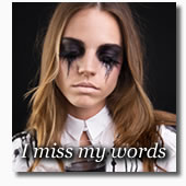
Have you ever seen a heading that has one or two words on a new line? I have and I think it looks less than lovely. Some will argue that it is the heading and that’s what it is so that’s what it will be, regardless. See the example image. Note that the last word of the heading is on a new line.

Long headings can be somewhat effective to share meaning with users and to apply specificity for search engine spiders, but I feel they’re best avoided unless really necessary. The main reason is they can look bad. But they can also make a site less consistent (if all other page headings are on one line) and possibility have an adverse effect on some readers.
Link Widows
Inline links cannot usually be dealt with. One can only do so much to perfect the initial, default look of the page. But links in menu can be addressed. Let’s say, for example, that you have a navigation menu with links for Home, About, and Contact. Adding a link to that menu that read, “Site Map, Search, and Accessibility Page,” just wouldn’t fit the flow, it would ruin the nav menu consistency, and break the overall look of the page.
Text Widows
If you look at just about any of my posts (assuming you’re using the common browser default text size of 16px), you may notice that is either a pretty big coincidence or I actually try really hard to keep paragraph widows to a minimum. You should notice that the last line of just about all my paragraphs is between one- and two-thirds the length of a full line. I aim for that length to help prevent browser inconsistencies from messing up my manufactured look. If the line is too short, it might end up being a one-word widow on some browsers. If the line is too long, other browsers might create a widow. This range I aim for prevents most of this.
Avoiding Widows
All of this is perhaps a bit silly, especially when one realizes that users can change my look at will, but my extensive print background makes me think of stuff like this. Maybe I’m being nit-picky or anal. Maybe I’ve elevated perfection to an unhealthy level, but to me this little stuff is all part of the larger package we call a web page, and to me, it’s all important.
So, how does one actually avoid web widows. Try the following:
- Change your wording.
- If it doesn’t look right, maybe the content can be reworded to effect the change you’re after. Only take this step if the text can be and should be edited for brevity or clarity. If this won’t be a natural fix, then maybe try one of the others. But you may find this is the smartest, fastest, and easiest method.
- Adjust letter spacing.
- This is one of those fixes that you must be careful with unless your style sheet edit will only affect the text you’re concerned with. If you do have that option, or care to add a new class just for this (not recommended unless you’ll get more use out of it), this is an easy fix that won’t be very noticeable unless the text is very short. An inline style could also be used, but I am trying to promote practical aesthetics here.
- Adjust word spacing.
- This almost identical to the suggestion above except instead of elongating (or shrinking) the spaces between letters, you’ll be adjusting the gap between words. If for some reason your text is justified, especially if you have narrow column widths, use this method and not the one above. Better yet, left-align your text… it’s more readable that way.
- Change text size.
- You could change the text size to make it fit, but you will have to be careful to apply your changes to the text in question only if you are to avoid global changes as would be the case if you increased the text size to a common structural or container element.
- Expand copy width.
- I admit you’d have to be desperate to employ this method, but since it will work, I did want to mention it as a viable options. This method, like the methods above, must be used, if at all, with great care as your changes may be global.
- Headings and Links in WordPress.
- I’m mentioning this method because a friend of mine, David Zemens (who I suspect also cares about the small stuff like this) came up with a cool method of manipulating page/post titles in WordPress to fix this specific issue. It uses WordPress’s Custom Fields function, which, combined with a little theme work, allows users to create a specific title for the post (and title element of the page), while offering a short title for the nav menu. David credits me for the idea, but it was he who thought of using it for titles/headings. I’m grateful; I use it on just about all my WordPress sites now.
On a scale of one to ten, with ten being the most important, this topic will likely be a one, But that doesn’t mean I can’t be bothered. Some developers can’t be bothered with small stuff like this (got bigger fish to fry), but when you’re trying to create the best possible site you can — as you do on all your projects — little stuff like this can tip the scales in your favor.
Photo credit: iStockphoto|Alija

David Zemens responds:
Posted: May 14th, 2008 at 12:39 pm →
Thanks for the very kind words, Mike. It humbles me that you find it useful and actually use the technique.
trovster responds:
Posted: May 14th, 2008 at 2:16 pm →
I don’t think these solutions can really work. One change of the users preference, font size for example or even just the font chosen from the font-family, and most of your methods fall down. However, Shaun Inman came up with an ingenious solution - simply adding instead of a normal space in between the penultimate and last word. He called this solution for typographic widows - “Widon’t“. Now whenever the last word flows on to a new line, it brings the penultimate word with it as well, thus negating the widow effect. Such a simple yet complete solution. Brilliant! I have just implemented in all the code I write now.
Mike Cherim responds:
Posted: May 14th, 2008 at 2:34 pm →
I agree, but all the methods will fall down if the user changes the defaults. These techniques are only for those initial load instances for most people and I never expect otherwise. That said, though, the plugin you pointed out sounds great as it supplies a solution that will hold up… I didn’t know such a thing existed. I thought I was the only one who really cared about stuff like this. Thanks for the link.
CJ Barnes responds:
Posted: May 14th, 2008 at 2:39 pm →
Re. your ideas for how to avoid widows: Why not just use a between the last and second-to-last words in each heading and paragraph? That way the browser will always keep the last two words together, putting them on a new line if necessary…
CJ Barnes responds:
Posted: May 14th, 2008 at 2:41 pm →
Sorry, repeated someone else’s comment - by the time I’d finished reading/typing someone else had got there first…!
Mike Cherim responds:
Posted: May 14th, 2008 at 3:16 pm →
That would work. Not an elegant solution, but certainly practical and doable. The only problem with it, and the plugin actually, is the size of the words. Say, for instance, the last two words were “is it.” That too would be a widow.
Tommy Olsson responds:
Posted: May 15th, 2008 at 1:51 am →
For printing, there is also the
widowsCSS property to prevent widowed lines on a new page (along with theorphansproperty). Of course, only the best of the best of browsers supports those properties.James Dimick responds:
Posted: May 15th, 2008 at 2:17 am →
This is great! I’m glad I’m not alone. I always noticed this problem but just ignored it because I thought I was being picky and weird. I’ve actually re-worded entire paragraphs in the past on my posts just so there would be any “widows”.
I’m also glad there is actually a word for this phenomena. I never knew that! Well, I do now thanks to your post.
*sigh of relief* Now I know I’m not alone on this. Maybe I’m not so weird after all…
…
Wait, I am.
John Faulds responds:
Posted: May 15th, 2008 at 4:36 am →
I’m reading this post in Opera and I’d say at least six of the paragraphs’ last lines are less than a third of the full length. In Firefox, that number’s probably only one. In light of those sort of variations, it’s probably not something I personally would worry too much about addressing.
Mike Cherim responds:
Posted: May 15th, 2008 at 6:04 am →
@Tommy: Thanks, I didn’t realize. I will be adding to my print sheets in the future. Let me guess, IE doesn’t offer support?
@James: Haha, welcome to the association
@John: The variations don’t surprise me. This site runs with some slight font-size variations, namely a bit smaller in Opera and a bit large in IE. I don’t see any on my FF on PC.
trovster responds:
Posted: May 15th, 2008 at 7:42 am →
@Mike: You might be interesting in something called Typogrify - is a collection of Django template filters that help prettify your web typography by preventing ugly quotes and widows and providing CSS hooks to style some special cases. And, some nice person has ported this over to a Wordpress plugin. Check out some examples of what you can do with Typogrify — totally awesome.
Mike Cherim responds:
Posted: May 15th, 2008 at 7:52 am →
That is awesome… thanks!
Gill responds:
Posted: May 21st, 2008 at 4:35 am →
Mike you have surpassed yourself
again.
I hate widows and have often spent ages rewording paragraphs to make sure I didn’t get any but then you change browsers or resize text and
darn.
Tried the hard space route a few times but several months later when I’m working on the site, I see it in the code, forget why it’s there, get all disgusted with myself for using it and promptly remove
it.
Tried css widows and orphans but it didn’t always have the effect I was after, especially in the usual culprit. Typogrify looks pretty cool though. I think I’ll give it a
go.
:-)
Mike Cherim responds:
Posted: May 21st, 2008 at 9:00 am →
Haha, I like the way you formatted your
comments.